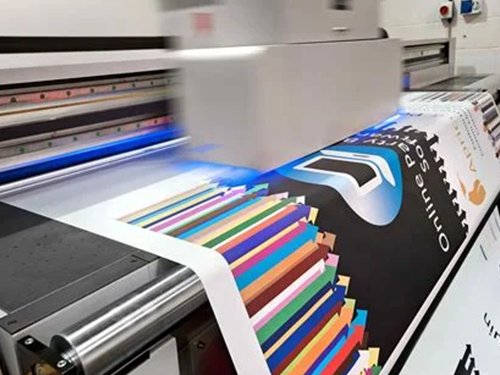
Large format print, or signage, can be a powerful tool for transforming your space, increasing brand recognition, and providing memorable customer experiences. However, designing creative and effective signage can be challenging. To create successful large-format print materials, it’s essential to understand the basics of designing for this format. This article will outline some fundamental steps you can take when creating your design files to ensure your signage is visually compelling.
File format for signage
Choosing the correct file format is crucial when designing signage. The ideal file format for large-scale graphics is PDF/X-4. However, other formats are also acceptable, including Adobe Creative Cloud files from InDesign (packaged), Illustrator (packaged), Photoshop, and high-quality JPGs.

Converting text to outline
Transforming text to outline ensures that your signage looks sharp and professional. This involves embedding, packaging, or altering the fonts used in your creative files. To outline font in adobe illustrator- Type>Create Outlines or Press Shift+Ctrl+O. Follow this step to ensure that your text remains crisp and clear at any size.

Vector> Raster
The design software could create two file types, i.e. Vector and Raster. Using vector graphics such as EPS, AI, and PDF to design large-format signage is best. Vector graphics can be scaled up or down without losing resolution or quality and are ideal for creating crisp, high-resolution graphics for signage.

Selecting Colour Models for Print
When setting up your print files for signage, the CMYK colour model is best to ensure that the colours appear as intended on the final product. RGB and CMYK are two different colour models used in a design, each with its purpose. While RGB has a more extensive range of colours in its spectrum and is ideal for computer monitors, it does not render correctly in print.

Pantone colour matching
Pantone Matching System (PMS) can convert Pantone swatches to the closest possible CMYK colour when designing and outputting to digital print. However, it’s important to note that the digital image cannot guarantee an exact match for every Pantone colour.

Text Margin
Establishing a text-safe space is essential to ensure clean and professional signage. This area should be approximately 95-96% of the width/height of the document, leaving a quiet stretch of 2% of the trim size on all four edges of the graphic. For example, on a 94 x 46″ board, the text-safe area would be 92 x 44″. Using this approach, you can ensure that no text or logos are too close to the edge of the graphic and that there is enough space for grommets around the edges of banners.

Guideline for Bleed
To prevent issues with white paper on the edge of a finished product or graphics, text, images and logos being cut off, it is essential to include a “bleed” in the file setup when a document has images or graphical elements that touch the edge of the page. Bleed is created by extending the image or feature beyond the edge of the paper, which allows the document to be printed on a larger sheet and trimmed down to size. The amount of bleed required depends on the size of the sign or display.

Guideline for image resolution
In large-format print, it’s important to use high-resolution images and graphics. This will help ensure your final product looks sharp and professional, even when viewed up close. Aiming for a minimum resolution of 300 DPI (dots per inch) would be best to ensure your images are clear and crisp. Additionally, you should avoid using low-quality or blurry photos, as these can appear pixelated when enlarged for printing.